Portfolio process / Grammarly
Behind
this design.
I used Codex to design and build this portfolio in the browser. My work at Grammarly became the first complete test—and this is the framework, feedback loop, and editing behind it.
View the finished Grammarly story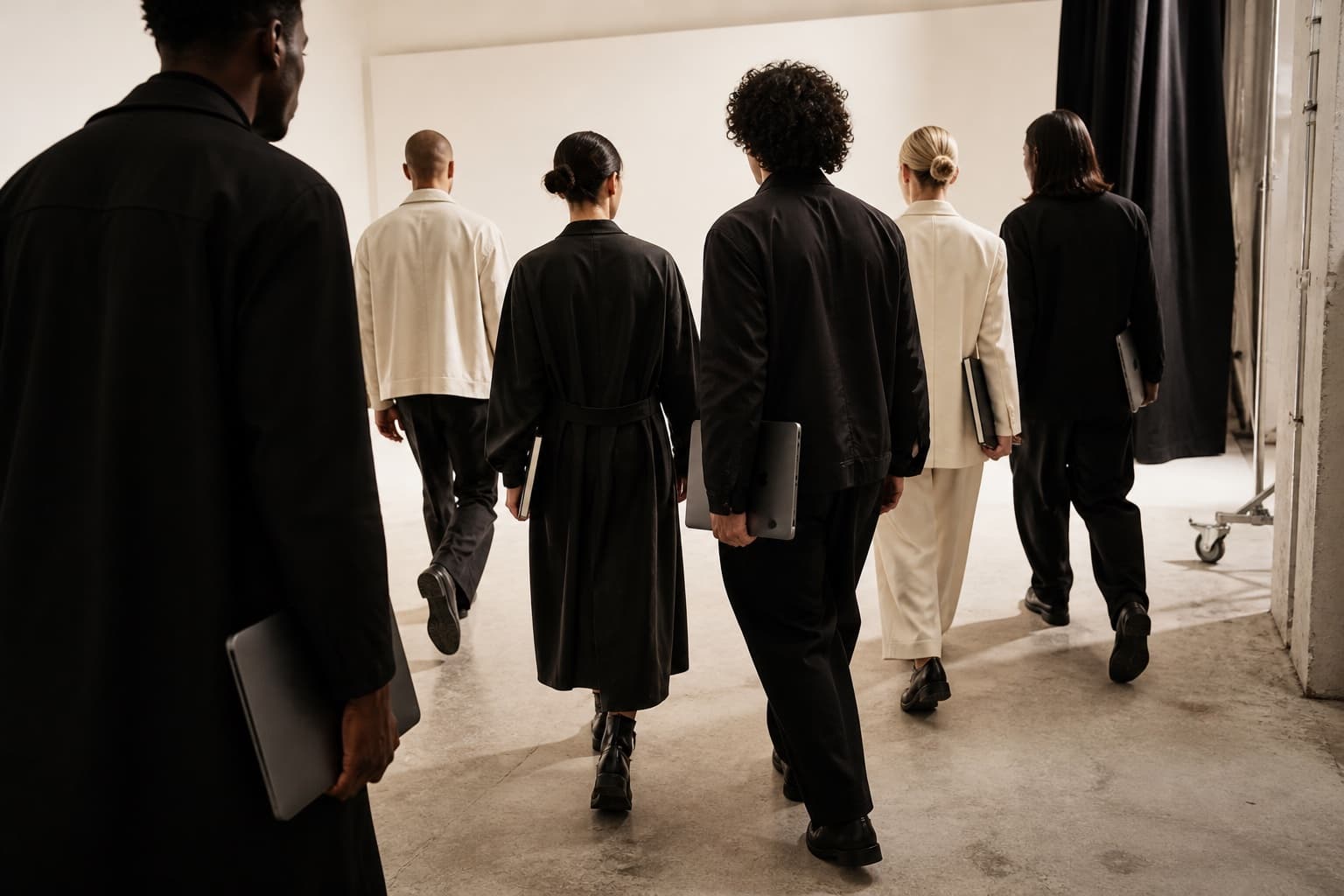
Start with evidence, not aspiration.
The first build gave me something to react to.
“Make a cultural object, not a portfolio.”
I began with a detailed brief and an expectedly low bar: generate a rough baseline. The first build wasn’t precious. It made the distance between the words and the experience visible.
Brief → generation 01 → useful disagreement
I split Codex into three roles.
The maker didn’t approve its own work.
- 01
Creative director
Protected the thesis, narrative, art direction, typography, motion, voice, and originality.
- 02
Design engineer
Built the responsive, accessible production experience in Next.js—and proved it in the browser.
- 03
Experience critic
Reviewed actual desktop and mobile renders, named the clichés, and said what to remove.
The early prototypes showed me what was missing.
Early Emil Kowalski design + motion
Early Jakub Krehel UX
Later Peter G. Yang no-ai-slop
I installed specialist skills when the work exposed a gap. Design and motion came first. The anti-slop pass arrived later, when the problem became language.
I turned a Pinterest board into rules.
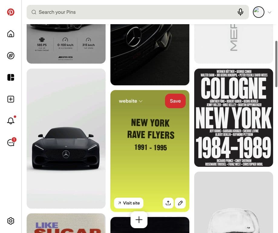
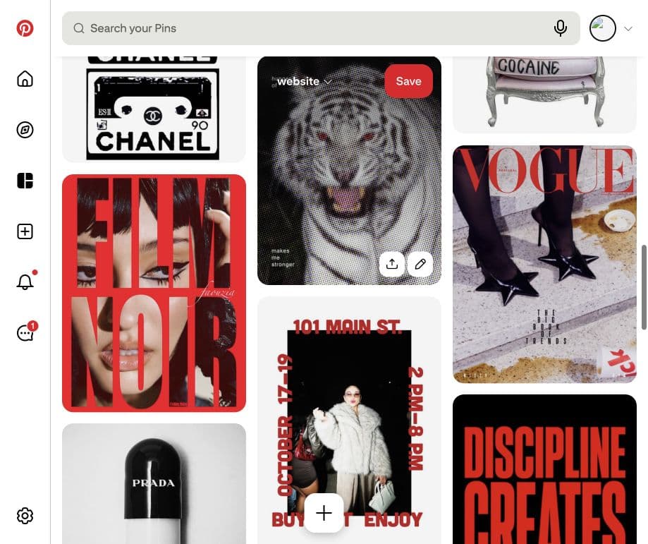
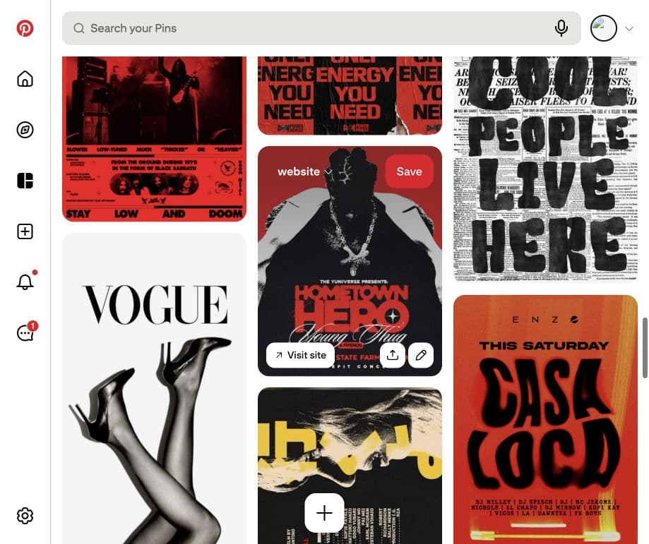
I shared 47 pins and extracted seven signals—not compositions to copy.
- 01
Precision / friction
Luxury precision colliding with subcultural roughness.
- 02
Cultural matter
Automotive, fashion, music, magazines, cassettes, posters—real objects, not abstract mood.
- 03
Controlled palette
Black, white, gray, bone, silver. Red interrupts. Acid appears only as a shock.
- 04
Editorial scale
Severe crops, enormous type, isolated objects, dense information, deliberate empty space.
- 05
Surface tension
Glossy metal and fashion photography beside xerox grain, halftone, torn paper, newsprint.
- 06
Type has a job
Editorial architecture or evidence—not an identity-animation gimmick.
- 07
Mechanical motion
Crop, track, expose, stack, cut, register. No soft morphs, glow, or generative fields.
The browser became the design tool.
Working prototypes tested color, shape, scale, balance, typography, imagery, pacing—and how the system behaved on desktop and mobile.
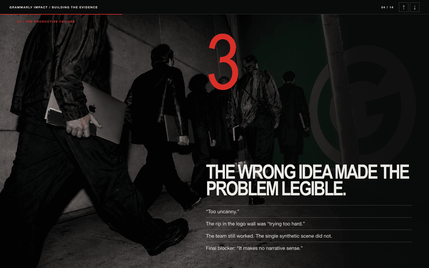
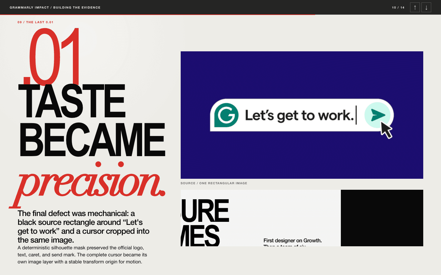
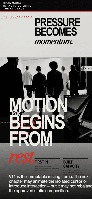
I stopped designing the whole site.
One story.
Grammarly.
I chose one story as the first complete test. Every design decision had to work there before it could be reused anywhere else.
I asked Codex for a tighter way to work.
Open-ended chat was too loose. Codex proposed three short questions.
- 01 / score
Score,
0–10? - 02 / direction
Direction:
closer / same / farther? - 03 / blocker
Single remaining blocker,
or none?
The answers told Codex where the proof stood, whether the last change helped, and what to change next—while keeping everything else intact.
Scores protected what worked. Blockers set the next edit.
A rising score protected validated decisions. When a score stayed flat, I killed the hypothesis instead of adding decoration.
Master scene
RejectedHero plus cuts
CloserToy
SameRhodia accumulation
CloserShared print system
CloserBorderless field
CloserNative UI shape
CloserKnockout type
CloserHero boundaries
CloserType rebalance
CloserExact extraction
None
Generated images became specific through direction.

Codex generated the team and Rhodia still life. I directed the people, objects, crops, and treatment, then supplied the personal details it couldn’t know. I really used the Rhodia notebook at Grammarly; this final image is a symbolic reconstruction.
STATIC V11 / 10.0
The page had to work before it moved.
“I wasn’t going to use movement to rescue shit input.”
The resting composition reached 10/10 first. Motion could deepen engagement; it couldn’t be asked to fix the design.
Kling supplied one loop.
One seamless 7.04-second walking loop. Codex built the browser sequence around it: camera, paper, Rhodia, written revenue proof, cursor.
- Camera
- Paper
- Rhodia
- Proof
- Cursor
Then I edited the words.
Elevated cross-functional collaboration to unlock transformative impact.
Built the Growth Design function.
Peter G. Yang’s no-ai-slop skill made the first pass. I reviewed the result and edited it again for honesty, cohesion, and clarity.
Each chapter became its own artifact.
At the end of Direction, Motion, and Story, I asked Codex to capture the iterative cycle as a standalone HTML story: failures, scores, decisions, final proof.
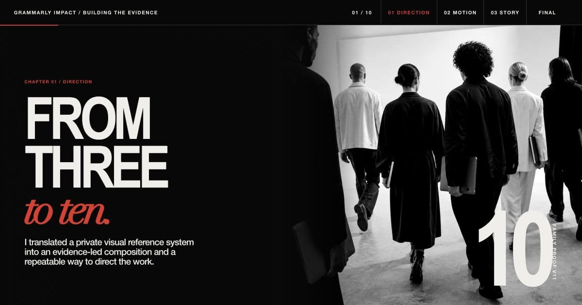
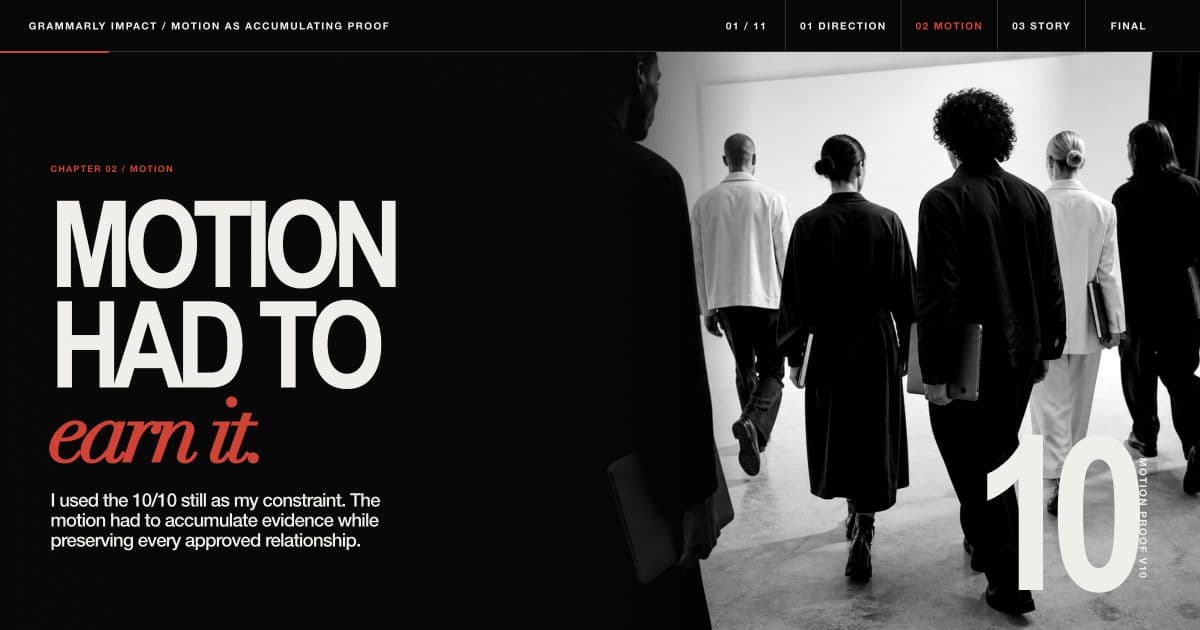
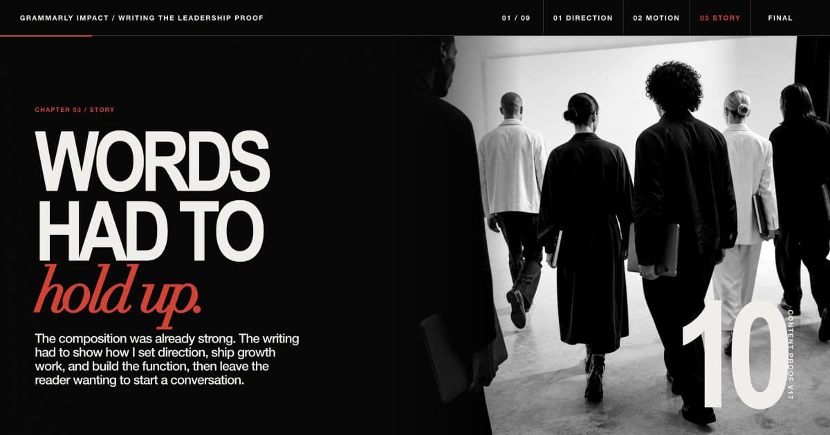
Black / bone / red. Prose / evidence / atmosphere.
Then I cut 42 slides to 30—and 30 to one page.
4214 Direction
14 Motion
14 Story
3010 Direction
11 Motion
09 Story
1This page
I kept the reusable methods and removed the exhaustive archaeology.